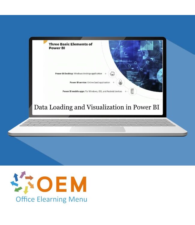
Microsoft Data Loading and Visualization in Power BI Training
€192,39€159,00Incl. taxExcl. tax
In stock
Data Loading and Visualization in Power BI E-Learning Training Certified Teachers Exam Quizzes Assessments Test Exam Live Labs Tips Tricks Certificate.
Read more.
Bulk discount
No discount
1 Piece
€192,39€159,00
2% Discount
2 Pieces
€188,54€155,82/ Piece
3% Discount
3 Pieces
€186,62€154,23/ Piece
4% Discount
4 Pieces
€184,69€152,64/ Piece
5% Discount
5 Pieces
€182,77€151,05/ Piece
10% Discount
10 Pieces
€173,15€143,10/ Piece
15% Discount
25 Pieces
€163,53€135,15/ Piece
20% Discount
50 Pieces
€153,91€127,20/ Piece
Make a choice
Officieel erkend testcentrum Online of fysiek examen afnemen
Bekroonde e-learning Inclusief proefexamens en 24/7 begeleiding
ISO 9001 & 27001 werkwijze 2.500+ organisaties gingen u voor
Maatwerk & gratis nulmeting Altijd op het juiste niveau gestart
Product description
Data Loading and Visualization in Power BI E-Learning
Order this unique course online! ✔️ 1 year 24/7 access to rich interactive videos, voice support, progress monitoring through reports and tests per chapter to immediately test your knowledge.
Why choose this course?
Power BI is a leading data visualization and analytics platform designed to make complex data sets accessible to businesses. This training provides a comprehensive guide to loading data and creating powerful visualizations in Power BI.
What you will learn:
Data Loading: Understand how to load data from different sources such as Excel, databases and cloud services.
Data Transformations: Learn techniques to model and transform data for accurate analysis.
Interactivity: Learn how to create interactive dashboards that are easy to navigate.
Visualizations: Develop an understanding of how to effectively display data with charts, maps, and reports.
Best practices: Get tips on optimizing your Power BI environment for maximum performance.
This course provides both theoretical knowledge and hands-on exercises, so you can immediately apply your Power BI skills in your work.
Who should participate?
This course is ideal for:
Data analysts who want to improve their skills in Power BI.
Business Intelligence specialists who want to create interactive dashboards and reports.
Business professionals who want to gain insight into data visualization and analysis.
Power BI beginners who want to build a solid foundation in data management and visualization.
IT and data engineers who want to learn how to integrate and analyze data in Power BI.
Whether you're a beginner or an experienced user, this course provides valuable insights for anyone working with data and reporting.
Demo Data Loading and Visualization in Power BI Training
Course content
Data Loading & Visualization in Power BI: Getting Started
Course: 1 Hour, 4 Minutes
Course Overview
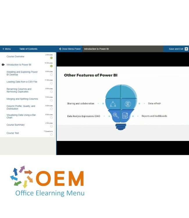
Introduction to Power BI
Installing and Exploring Power BI Desktop
Loading Data from a CSV File
Renaming Columns and Removing Duplicates
Merging and Splitting Columns
Column Profile, Quality, and Distribution
Visualizing Data Using a Bar Chart
Course Summary
Data Loading & Visualization in Power BI: Loading Data from Databases
Course: 1 Hour, 13 Minutes
Course Overview
Loading Data from SharePoint
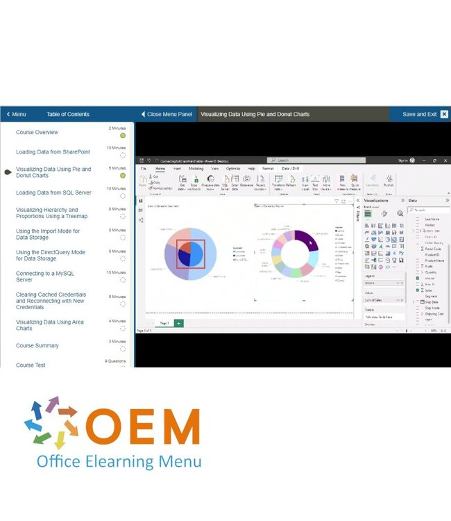
Visualizing Data Using Pie and Donut Charts
Loading Data from SQL Server
Visualizing Hierarchy and Proportions Using a Treemap
Using the Import Mode for Data Storage
Using the DirectQuery Mode for Data Storage
Connecting to a MySQL Server
Clearing Cached Credentials and Reconnecting with New Credentials
Visualizing Data Using Area Charts
Course Summary
Data Loading & Visualization in Power BI: Loading Data from Cloud Storage
Course: 1 Hour, 29 Minutes
Course Overview
Uploading Data Into Google BigQuery
Loading Data from Google BigQuery
Visualizing Data Using a Matrix
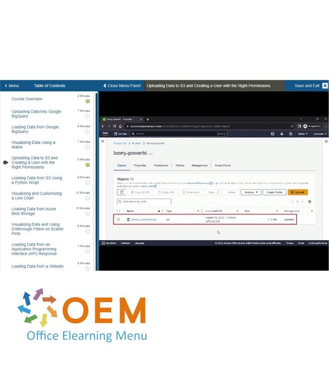
Uploading Data to S3 and Creating a User with the Right Permissions
Loading Data from S3 Using a Python Script
Visualizing and Customizing a Line Chart
Loading Data from Azure Blob Storage
Visualizing Data and Using Drillthrough Filters on Scatter Plots
Loading Data from an Application Programming Interface (API) Response
Loading Data from a Website
Course Summary
Data Loading & Visualization in Power BI: Data Modeling
Course: 2 Hours, 2 Minutes
Course Overview
Loading Data for Calculated Tables
Creating Calculated Tables Using INTERSECT
Creating Calculated Tables Using NATURALINNERJOIN
Creating Calculated Tables Using UNION
Creating Calculated Columns
Creating Multiple Calculated Columns in a Table
Loading Data for Data Modeling Using Relationships
Setting Up One-to-One Relationships between Tables
Setting Up One-to-Many Relationships and the Cross-filter Direction
Configuring Many-to-Many Relationships
Setting Up Many-to-Many Relationships and Cross-filter Direction
Displaying Star Ratings Using Calculated Measures
Creating Calculated Measures Using DAX Formulas
Understanding the Default Date Hierarchy
Using Time Intelligence and Date Hierarchy Drill Down
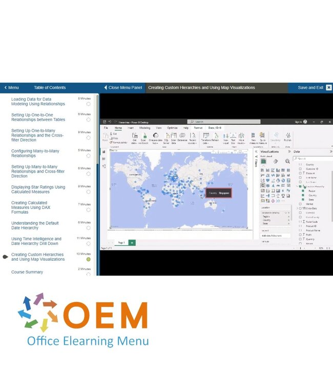
Creating Custom Hierarchies and Using Map Visualizations
Course Summary
Data Loading & Visualization in Power BI: Advanced Visualizations
Course: 1 Hour, 31 Minutes
Course Overview
Visualizing Data Using a Gauge Chart
Visualizing a Recruitment Pipeline Using a Funnel Chart
Analyzing Flows Using Sankey Diagrams
Displaying Flows through Multiple Sets of Nodes
Viewing Project Schedules Using Gantt Charts
Customizing Gantt Charts
Comparing Multiple Variables across Categories with Radar Charts
Analyzing Profits Using a Heatmap
Using Calendar Layouts with Time Series Data
Course Summary
Start your Power BI journey today!
✔️ Learn at your pace with interactive videos and hands-on exercises. ✔️ Test your knowledge and track your progress with reports. ✔️ Create impressive dashboards that provide insight into your data. ✔️ Receive a certificate of participation after successfully completing the training.
Order your course now and become an expert in Power BI!
Specifications
Article number
147651534
SKU
147651534
Language
English
Qualifications of the Instructor
Certified
Course Format and Length
Teaching videos with subtitles, interactive elements and assignments and tests
Lesson duration
7:11 Hours
Progress monitoring
Access to Material
365 days
Technical Requirements
Computer or mobile device, Stable internet connections Web browsersuch as Chrome, Firefox, Safari or Edge.
Support or Assistance
Helpdesk and online knowledge base 24/7
Certification
Certificate of participation in PDF format
Price and costs
Course price at no extra cost
Cancellation policy and money-back guarantee
We assess this on a case-by-case basis
Award Winning E-learning
Tip!
Provide a quiet learning environment, time and motivation, audio equipment such as headphones or speakers for audio, account information such as login details to access the e-learning platform.
Heeft u vragen over dit product of hulp nodig bij het bestellen? Onze AI-chatbot is 24/7 beschikbaar, of neem contact op via [email protected] of bel +31 36 760 1019
Heeft u vragen over dit product of hulp nodig bij het bestellen? Onze AI-chatbot is 24/7 beschikbaar, of neem contact op via [email protected] of bel +31 36 760 1019
Data Loading and Visualization in Power BI E-Learning Training Certified Teacher...
€192,39€159,00
Specifications
Article number
147651534
SKU
147651534
Language
English
Qualifications of the Instructor
Certified
Course Format and Length
Teaching videos with subtitles, interactive elements and assignments and tests
Lesson duration
7:11 Hours
Progress monitoring
Access to Material
365 days
Technical Requirements
Computer or mobile device, Stable internet connections Web browsersuch as Chrome, Firefox, Safari or Edge.
Support or Assistance
Helpdesk and online knowledge base 24/7
Certification
Certificate of participation in PDF format
Price and costs
Course price at no extra cost
Cancellation policy and money-back guarantee
We assess this on a case-by-case basis
Award Winning E-learning
Tip!
Provide a quiet learning environment, time and motivation, audio equipment such as headphones or speakers for audio, account information such as login details to access the e-learning platform.
Wij gebruiken functionele en analytische cookies (Google Analytics). Geen persoonsgegevens voor advertenties. Kies hieronder of beheer uw voorkeuren.
Manage cookies